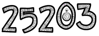
I've long been scrutinising my diurnal age and tweeting my findings. Lately organising information about my daily number in Airtable. Occasionally I've presented my number using an ornate font, such as a made available at sites like fontspace.com. Typically, I'll display the number as large as possible (often 200 point size) and then take a screenshot of it. I'm now considering doing this on a more regular basis and experimenting with a wider variety of fonts. It's a way of adding an extra dimension of interest to the number, rather than focusing purely on its mathematical properties. At the same time, my artistic side gains some stimulation.
Here is what I created today using the KBZipaDeeDooDah font and the Autodesk Pixlr application on my Mac.
This is very simple of course. I just selected a sticker from one of those available in the antique category, pasting and then positioning it as shown. The black and white tone of the original number is preserved and the fob watch reinforces the diurnal significance. I've posted this particular image to Instagram replicating it so that it appears three times in a 1:1 ration image (using an option available under Instagram's Layout App).
ADDENDUM: I've since started an Instagram username of Numbered_Daze where I post my diurnal age daily, using a different font each time. This was today's post (12th September 2018) and the font used is called Gears:


No comments:
Post a Comment